The new me {logo update}!
/Things look a little different around here, don't they?
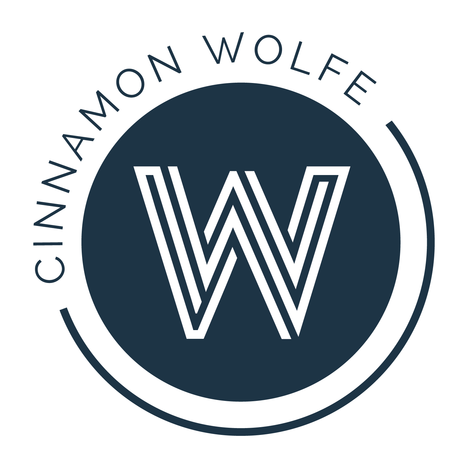
I've been wanting a logo update for a while now. I was in the process of figuring everything out with other blogs/online presence, and when I finally figured that all out, I knew CWP was next in line for a refresh.
My first logo was a labor of love. I clumsily created the type in Elements when I had my 30 day trial. I had NO idea what I was doing. I somehow got the type on top of a background in PicMonkey and viola...I had a logo. I liked it, but I knew it wasn't created very well so I always felt it wasn't everything it could have been.
I worked with a designer on a few different things, but after back and forth for a few months and not really getting anywhere she told me she was bogged with school and wouldn't be able to get much further any time soon.
While disappointed, I wasn't going to let myself be discouraged. I also had a really solid idea of what I wanted, but am not skilled enough in Photoshop to make it a reality. Plus theres that whole, "not a graphic designer" thing. I put a feeler out in one of the FB photography groups I am a part of and within a few hours I had some good solid leads. I reached out to one of them on Sunday evening and by Wednesday my vision had become a reality. I could not have been more excited.
This was the rough version that I came up with in Photoshop. My idea was to represent bokeh (which is the beautiful blurred circles that occur in the background of your photo when you have a shallow depth of field). I also really like and respond to graphic shapes so the circles really appealed to me.
After a few back and forths my new designer had this beauty for me and I knew that it was sooooo me. I LOVE it.
Thank you Josh Koch from 2J's Photography for helping me create something I love! I can't wait to get it ON things so I can see it everywhere. =)


