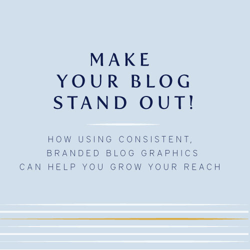

Make your blog stand out with branded blog graphics
/The branded blog graphic. Not a new thing by any means but something that I think holds a lot of people back from really taking their blog to the next level in terms of not only being branded, but standing out in the sea of sameness that is out there in the internet land.
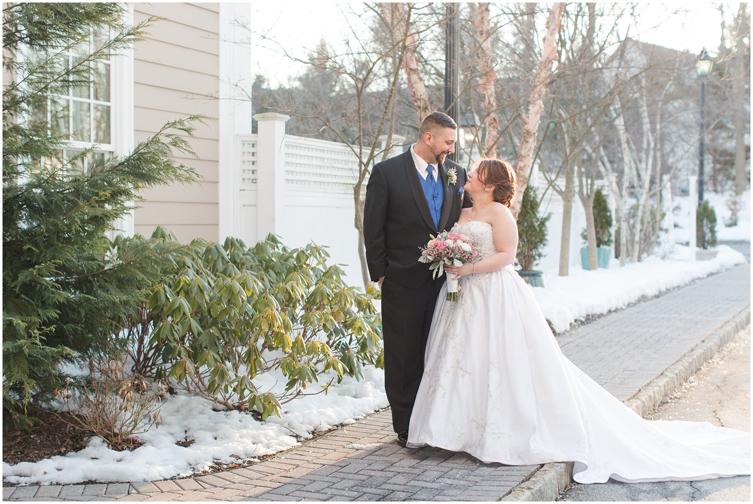
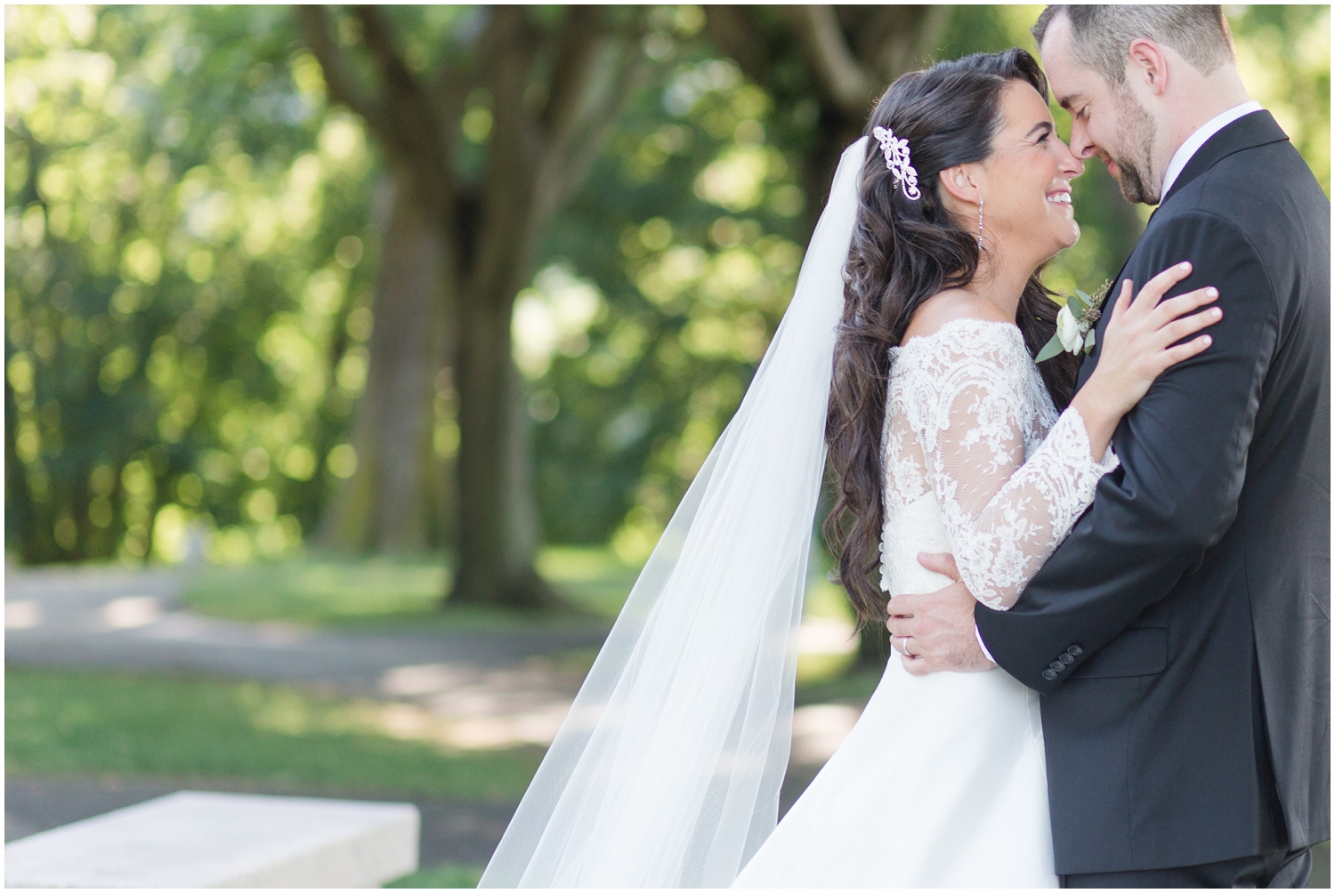
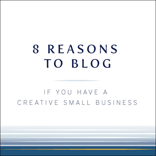
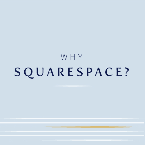
What is a branded blog graphic you ask? Well there happens to be one right underneath this sentence ;-)

Why use branded blog graphics?
Ties your blogging into your brand
You may or may not have a blog associated with your business, but if you do, you want to make sure your brand ties in nicely within your blog. Having graphics within your blog posts that tie in with the elements of your branding will tie everything together nicely and create continued consistency of your brand message.
Your brand is more recognizable
Incorporating elements of your brand within blog posts and on your blog page itself (translation: Sidebar baby!!) points people to your brand without being super obvious or in their face. I'm sure many of you photographers out there are highly familiar with the statement "I knew it was (so and so's) photo instantly because their style is so recognizable". You want the exact same thing to happen with your brand. The more elements you can put out there in the world to show off who you are will result in this same thing happening with your brand itself.
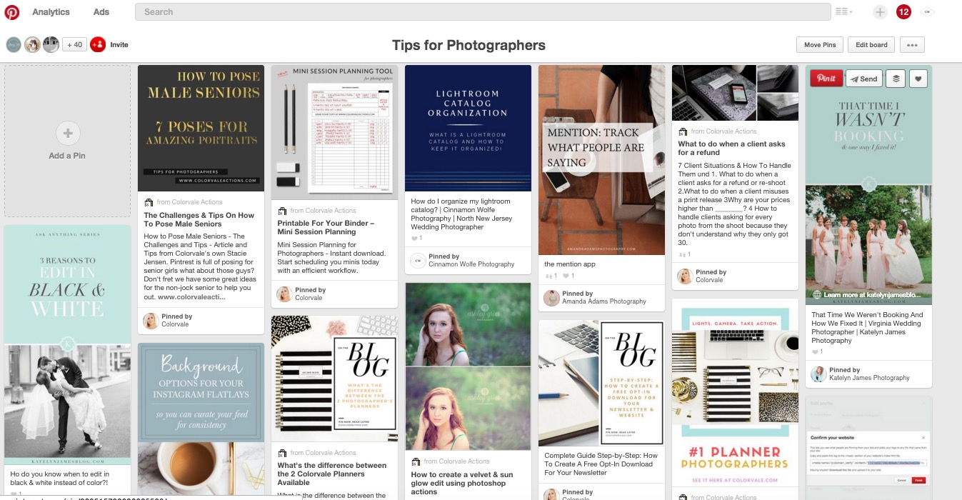
Here is a great example. This is a screenshot of a popular RTS pinterest board in which I am a contributor (I am able to add pins to it specifically). My graphics are similar but different and very recognizable amongst the other pins on the board. You instantly know that they are all from the same website or brand.

Consistency and cohesion
Consistency and cohesion both contribute greatly to inspiring a sense of professionalism and trust with your audience or target.
I know that when I land on a blog and the images are all over the place or use different fonts and styles on every other post, it just makes me feel uneasy. I get a sense that the writer or blogger can't make up their mind and or can't make a decision on direction and any trust or confidence I had in their content kinda sorta flies out the window. I hate to say it but its true!
But when I land on a website that has consistent branding and messaging throughout the site, it bolsters the trust I have in what that blogger or website owner has to say. I know that sometimes it feels like your branding might become tired and you want to try something new, but be strategic about it and make changes slowly and purposefully.
I recently went and updated quite a few of my graphics because even though they were branded, I felt like they still weren't cohesive enough. I reduced the number of designs I use and changed out the old graphics on my past blog posts. I am super pleased with the results!
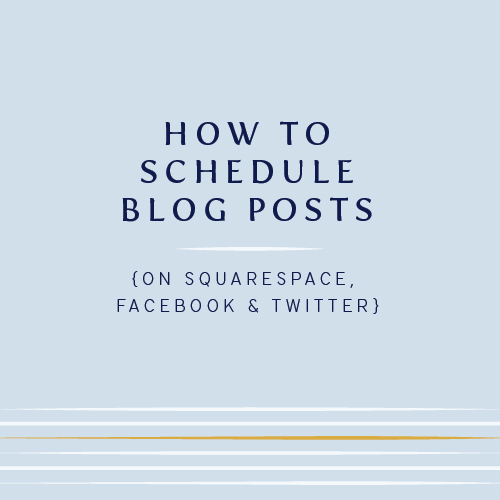
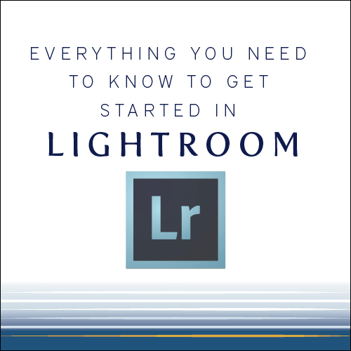
Example of previous graphics:


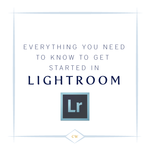
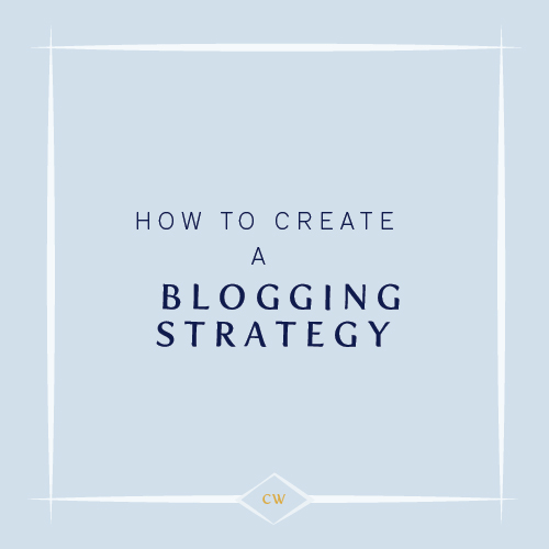
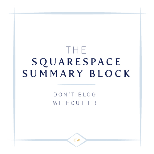

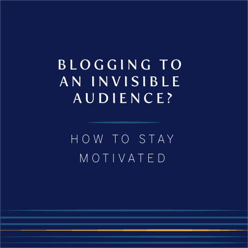
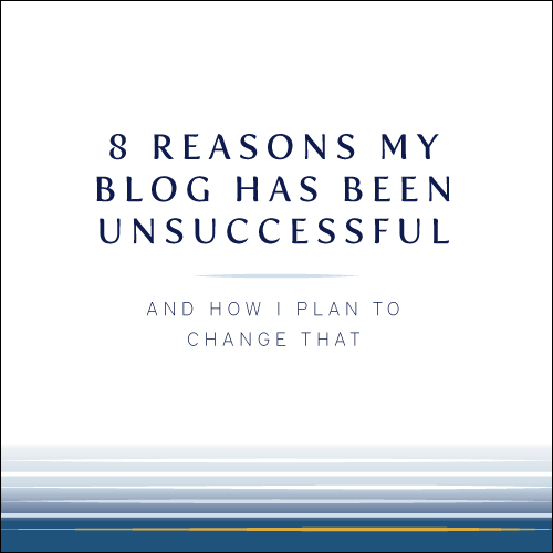
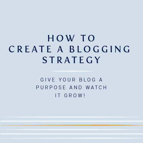
Example of new graphics:


How do you create branded blog graphics?
Adobe Illustrator
The initial design of my blog graphics was done during my branding process which happened back in June of 2015. Lauren and I talked extensively about this as this was super important to me going forward as someone who is heavily invested in blogging, but also not so good at any sort of graphic design.
She set up a template for me utilizing my branding colors and showed me how to use Adobe Illustrator going forward to update my new graphics with current title and also how to add personal images into the template if I want to go that route instead of using a template with the solid color background.
Although Illustrator has a learning curve, for the limited things I need to do with it, it actually works really really well. I can usually create a graphic (once I have landed on my blog title) within about 5 minutes or less.
Sometimes, when I'm really on my game and have blog posts planned out far into the future, I can go in and create multiple graphics at once to save time.
Fonts
Its important to keep your fonts and style cohesive. I struggled with this for a while as well. The fonts associated with my brand (fertigo pro and district thin) are not flowery or flowy or romantic. But then I have to remember that neither am I! My brand is a very good representation of who I am as a person and I'm simply not a flowery, pink-y, super sweet romantic-y type of person. I'm more structured but fun and I think my fonts actually portray that really well.
I do have a secondary font that I can use when the occasion calls which is a little more "loose" and I've incorporated it a few places within my site and plan to use it more in the future!

Size
The size of your blog graphic is another thing you need to consider. You will see tutorial after tutorial tell you that your graphic has to be a vertical image for you to get any interest on pinterest at all and while I do think there is some truth to that, I feel like your title and branding have MORE impact. I get 10-20 repins a week which I consider a huge win considering I don't push pinterest as much as I should and have limited presence currently.
Although I do think that your images should likely not be horizontal (landscape) because those images do tend to get lost in the pinterest landscape, a square or vertical image on pinterest does tend to stand out from the crowd.
See below...that poor image in the top row is hardly noticeable next to the other images. Its hard to see, there is no branding with it and it almost looks squished next to the bigger, branded images surrounding it!
Alrighty! I hope this post has been helpful to you in some way if you are considering adding branded blog graphics to your current blog posts! Put a little bit of time and energy into it and you'll see it pay off in big ways down the road!