
Why I changed my Squarespace website template
/Things look a little different around here today don't they?
I've been mulling over a slight change to my website for a few months now, especially since designing websites for some other creatives. I've been experimenting with other templates Squarespace offers and seeing some of the features they offer and all of that together has prompted me to make some slight changes around my internet home. The result is a place that feels more like "me" and showcases my work in a better way.
The first thing I'd like to mention is that despite conflicting advice from many experts in the industry, I don't necessarily think it's a bad thing to make changes to your site or update it as you move further and further into your business, as long as you aren't changing things every single week!
I went through a major rebrand last summer and even though it hasn't even been a year since that process ended, my business has changed and evolved slightly over the past few months and updating my website to adapt to those changes isn't necessarily a sign of restlessness, on the contrary, it's a way for me to adapt to the changing nature of business and growth that occurs in all small business ownership.
I also don't view changes or updates as a fast ticket to success. I've seen many others verbalize the feeling that's down there deep inside us all that if I just get this tool or resource or website platform, all my problems will be solved and the clients will just come flooding in the door. I hope we realize there is no one stop shop to success when it comes to small business or wedding photography. Try things, let them sit for a while and analyze the results.
If things need tweaking, tweak.
At the same time, if certain aspects of your business are working well for you, but you see some different things are working wonders for the photographer you idolize on instagram, don't change everything just because of that. Don't break something that's working just because you can.
All of that being said, I took a good hard look at my website and realized a few things.
- Since I don't have a ton of wedding work, I needed a better way to showcase what I DO have so it's more obvious that I am focused on booking more weddings.
- Some choices I made regarding branding guidelines were making my site feel too heavy....I needed a way to lighten some things up to feel a little more friendly and classic
- I needed a better way to showcase some of the options I have for photographers including blog outsourcing, website and squarespace consultation and mentoring
- My blog needed a bit of a facelift
I started by analyzing templates. I knew that I wanted a header image that spanned the entire width of the canvas and I wanted it to be thinner than what I had currently. I also wanted the ability to have my logo either centered or to the left of my navigation bar. Overall I felt the top of my site took up too much room above the fold and I wanted to fix that.
The template I was using prior was called OM. It's not a super popular template but it was really functional and included a sidebar option for the blog. I decided to switch to the FIVE template mostly for the header images, functionality and blog sidebar (you can actually have TWO sidebars on the five template!)
Old template out: OM
New template in: FIVE
New Home Page
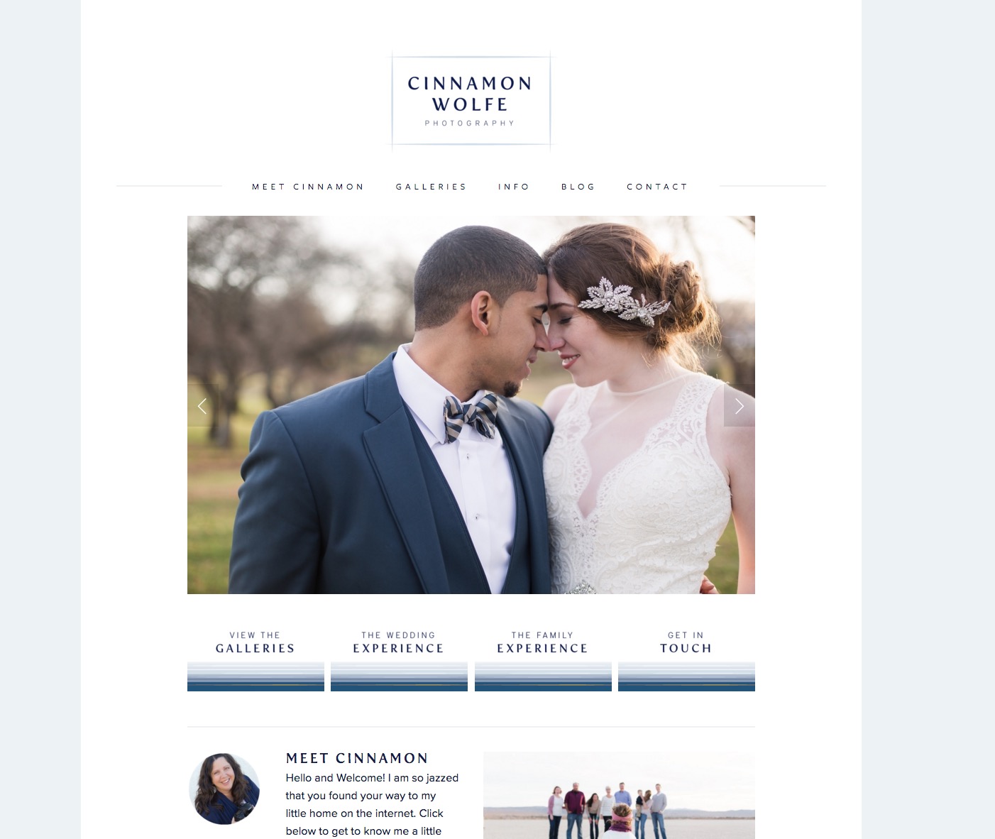
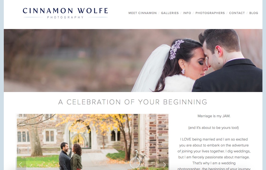
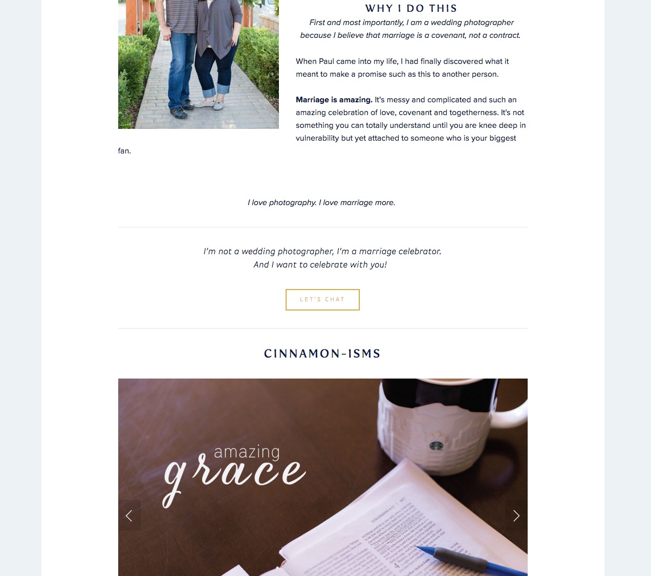
The major changes include the top navigation, the header image and the flow of other things included on the page. I also have the header image AND a gallery of images to showcase just a little bit more of my wedding work and also a brief description of how I feel about marriage etc...
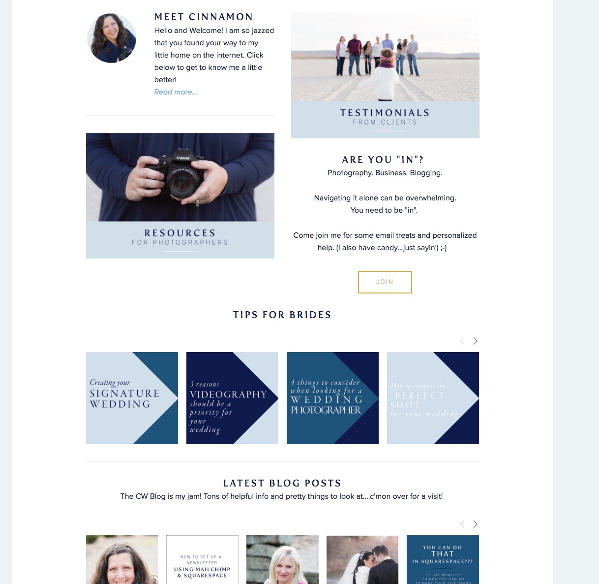
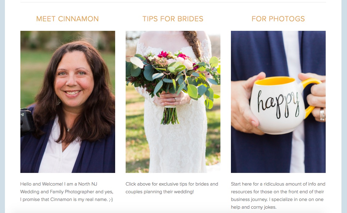
The middle section is one of my favorites because it gives a clear description of some of what else you can find on my site including more information about me, tips for brides (another way to showcase a wedding image on the home page) and then info for photographers.
New About Me Page
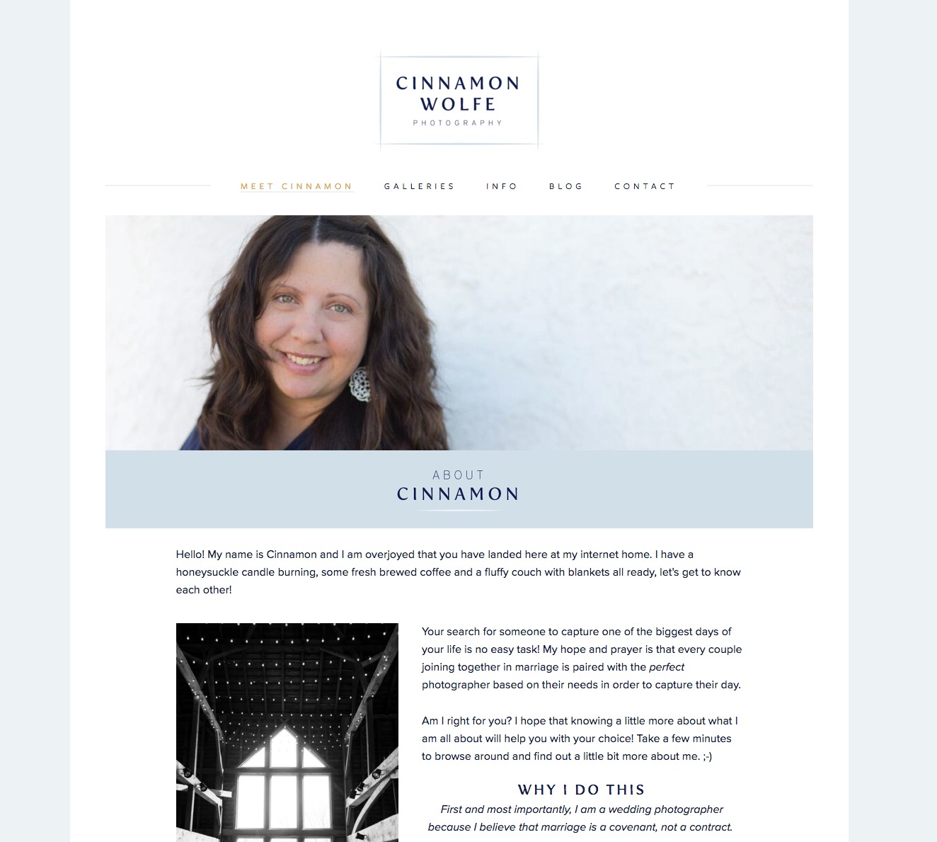
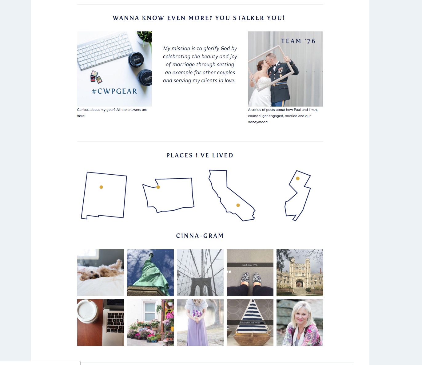

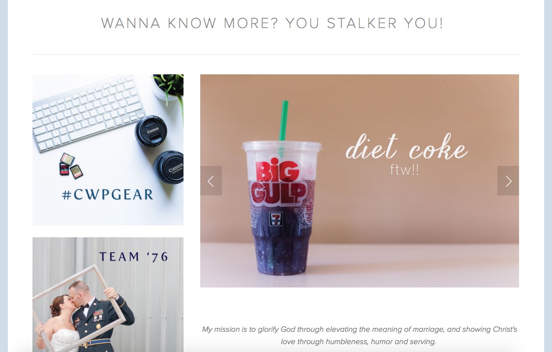
This is probably one of my favorite changes about the site. Unlike most people, I love writing the about me page. Once I stopped viewing it as a difficult thing to do and instead viewed it as a way to let potential clients know as much about me as possible so I can either attract them or send them away, everything became much, much easier.
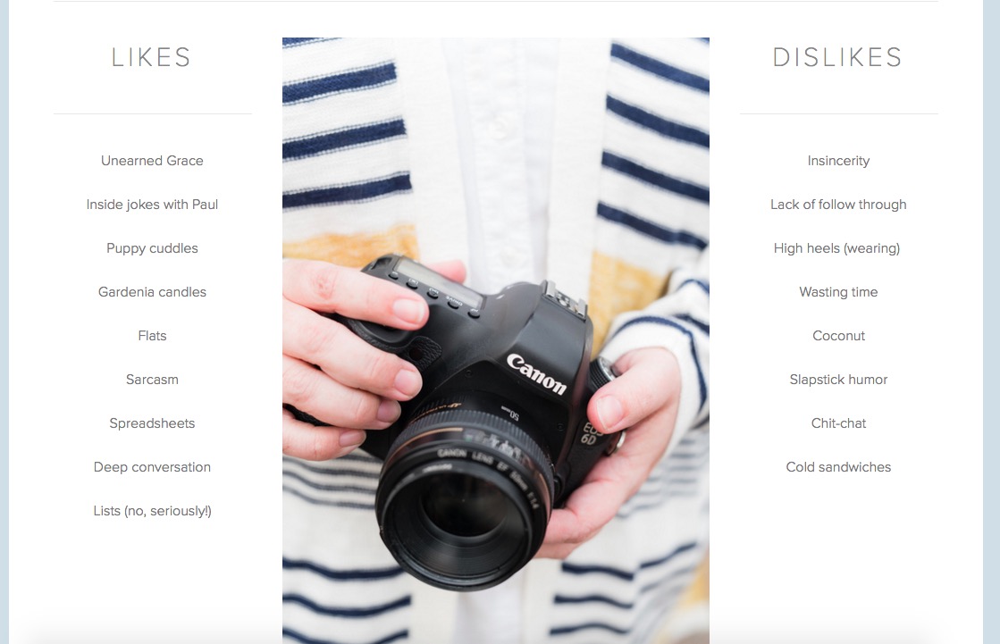
The header image (thank you to my friend Debbie for the photo!) showcases what I do (in action) and then the text mostly remains the same with some slight changes.
I also added in a new section of Likes and Dislikes (which I LOVE!) This is such an easy way to really communicate more about who I am as a person so that potential clients or brides can feel like they know me before they ever meet me.
New Blog Page

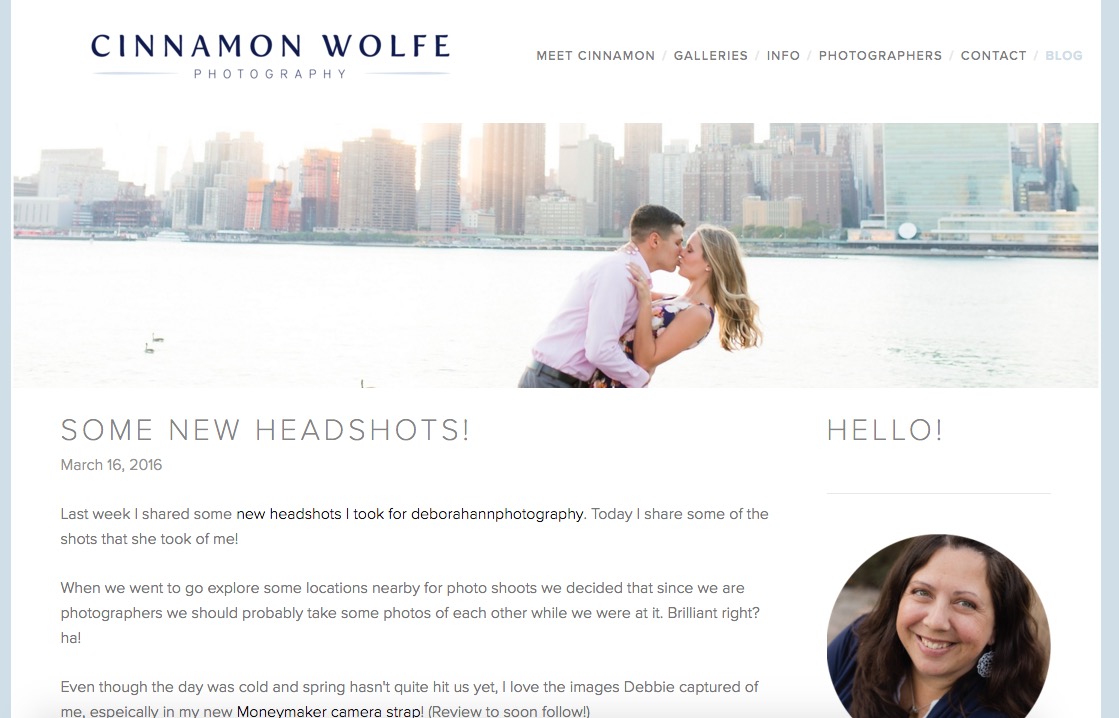
I am soooooo in love with how the new blog page looks. With the addition of a header image it just ties everything together and gives me another opportunity from the top of the page to communicate what I do. Another major thing I changed is all of the typography. Instead of my headers and titles being the same font as my logo, I changed to a different font that still plays nicely with my logo, is easy to read and looks lighter and friendlier. I'm smitten.
I changed my sidebar to the right side of the page as opposed to the left because I wanted the content to be the main focus of the page and since we read left to right it only made sense to have the sidebar on the right.
New For Photographers Page
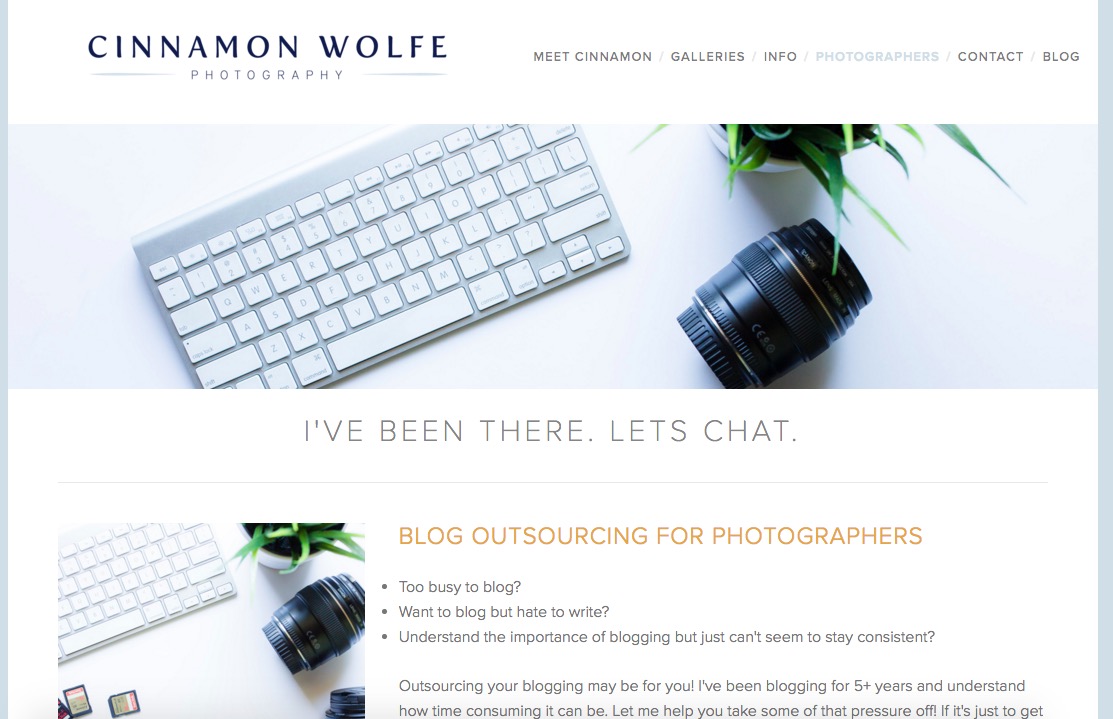
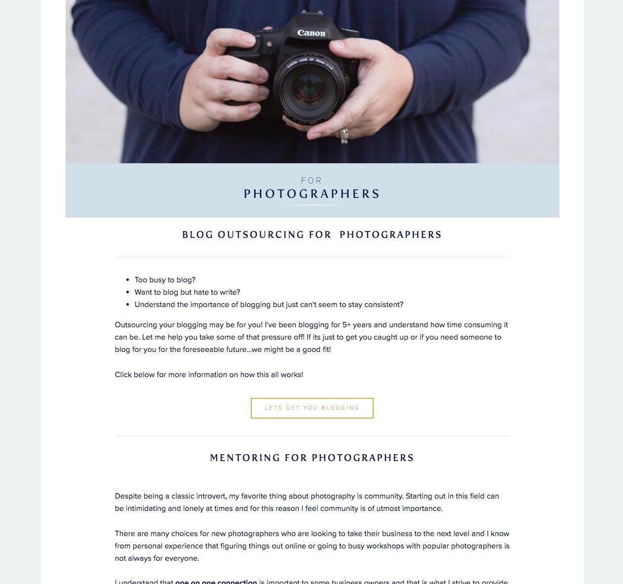
Another update I'm super happy about. Everything about this page feels lighter, brighter, friendlier and more professional.
While I would love to go through and show you every single page and change that I made, I'll let you navigate around the new site a little bit on your own. Let me know what you think! I'd love to hear your thoughts about the changes. And if you find any typos or links that don't work, PLEASE let me know!
I will have another post soon about the logistics of HOW I did all of this in one night.
YES, you read that right, ONE NIGHT!