Harsh, Even and Back Light // examples

Photography is all about light. No matter what your style, light will affect everything about your photo. Where you place your subject, how you expose and then end result of your photograph are all heavily dependent of what type of light you have available and how you make use of it!

You will constantly hear photographers (especially natural light photographers who work mostly outside) talk about "looking for the best light". Before I was a photographer (and honestly even for a while after I started) I was MUCH more concerned with background than good light. But when you REALLY think about it, the subject is the point of the photo, not necessarily the background so you want to make sure that your subject is in the best light possible!

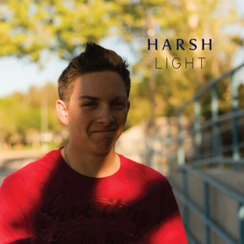
I was out on a session the other day and a friend of mine came along who is interested in learning more about how to use her camera etc...My devastatingly handsome stepson was with us as well and an opportunity presented itself out of the blue while we were waiting for my clients to arrive. I was explaining the concept of harsh light, even light and backlight and we happened to be standing in the exact perfect location for me to get a great example of all three situations!

harsh light even light back light

These three photos were taken in under a minute and I didn't even move, I just changed the placement of my subject (cheesy grinned Kyle.) Also important to note, these photos are all SOOC (straight out of camera). 

Harsh Light

In this first image, the sun was to my back. There were some trees behind me, which are causing that unfortunate shadow across his face and chest. The bright sun shinning on the background completely draws your eye away from the subjects face and even if he would have had an amazing expression on his face, there are too many distracting elements in the photo that it would get instantly lost. I do like the leading lines of the blue fence behind him, but again the light in this photo is so bad that they get lost as well.  

cinnamonwolfephotography

Even Light

You can instantly see a HUGE improvement in this next photo. I sat him down on the stairs that were just to the right of where we were in the first photo. The exposure on his face is totally even with no crazy shadows or hot spots. The exposure on the background is ALSO even (which is so important) Because of the light colored concrete, that also served as a natural reflector to bounce more light onto his face. I framed the photo with him in the middle and cropped in camera so that the background was completely evenly light so there were no distracting elements. 

cinnamonwolfephotography

Back Light

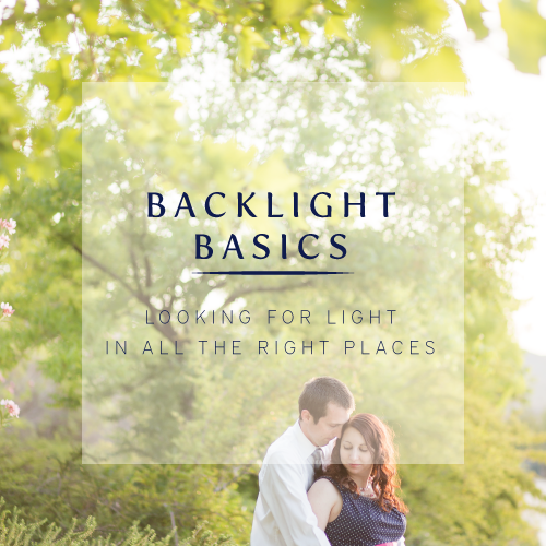
For this photo we were in almost the exact opposite position of the first photo. Now the sun was at his back and I was facing into the sun. Because the tree was there, there was enough diffused light so that the sun wasn't directly hitting my lens causing a ton of haze or flare. I popped a white reflector underneath him just to get a little more light onto his face. His face is evenly exposed and even though parts of the background are more blown out than others, the backlight offers a dreamy golden glow that is almost always visually pleasing. 

Looking at this photo now, I should have had him stand a little to the left (when looking at the photo) so the tree isn't coming out of his head!) Those are always good things to look for when framing your subject in your shot. It can be pretty distracting. Now that I've mentioned it, its probably bugging you too huh!? =) 

cinnamonwolfephotography

Whenever I'm studying specific information on how to do something or how to achieve a certain result, visuals are always helpful for me. I hope to provide many posts like this in the future! I hope you found it helpful to see some examples. As always, shoot me an email or reply in the comments if you have any questions! =)

These three images all shot on:

Canon 6d
50mm f/1.4

Settings were f/2.8 ISO 400 and shutter speeds were 1/3200, 1/640 and 1/1000 respectively. 

CWP Branding // Meet my designer!

In late January of 2015, I had been thinking hard about all things branding and trying to decide what exactly to do. I was also in the market for a new planner. (More on that in a bit.)

branding_meetmydesigner

I had pretty much come to the conclusion that I needed to hire a professional to guide me through the branding process, but I didn't really know where to look. In a few of the facebook groups I am in, every now and then a thread pops up that looks something like this: 

"I've decided my logo is boring and I'm tired of it. Time to rebrand. Anyone know of a reasonably priced contact to redesign my logo? Aaaannndddnd GO!"

Most of the people tagged are other photographers who might also be really talented in PS or Illustrator and their price tag is around the $100-$200 mark. I knew at this point I needed something more and a fb call out wasn't going to do it for me. 

What do you do when you don't know what to do or where to look for something? Google it is. 

Trouble was, I didn't really know what to Google. I tried "I need to rebrand my photography business" and came up with one result that after some research and reviews seemed a little on the shady side. Eventually I found another couple of hits but their websites were a little difficult to navigate, I didn't get a clear picture of the service they provided, they seemed a little out of my league and none of them actually had very much information on the designer themselves. I don' think I actually saw one picture. This kind of scared me. I want to know who I am working with!!

I got frustrated and decided to put the search on hold. I went back to researching planner options which was something else I was doing that day. 

Later on that evening I was scrolling through instagram and one of the people I follow mentioned something about how they loved their new planner designed by @laurenelizhook. I clicked over to her IG to check things out find out more about this apparently awesome planner that she designed. 

What I was greeted with was (in my opinion) God showing me a huge green light and saying "here you go! you needed someone to help you with branding, here she is!" 

Through her IG, I noticed her style was clean and organized. It was like visual eye candy. I saw some inspiration boards announcements for new brands. I was slightly confused but also enthralled. I pulled out my computer and quickly pulled up the website for her business, Elle & Co. 

WOW.

I could literally NOT hold my excitement, I might have squealed. Not only was she an amazing designer of things like planners and cards etc...but she offered branding services. Her process was so clean and organized and CLEAR. She had pictures of herself all over her site. I knew instantly that she used Squarespace for her site which made me love her even more. I KNEW that this was the gal for me. I had ZERO doubt whatsoever in my mind. I contacted her the next day and the process began soon after. 

The thing I realize now more than ever is how important branding is. I am Elle & Co's ideal client. Everything she has done, all the work that has gone into her brand communicating to the exact type of client that she wants to attract worked. It pulled me and hooked me almost instantly. Even though her services initially were more than I wanted to spend, I knew that the investment would be worth it to work with her. This is how I want ALL of my future clients to feel. I want to attract my ideal client so we can have an amazing experience together. I will refer her to other people who I know would want something similar, more of her ideal client. This is how this is all supposed to work and I am over the moon excited to really dig in and get this process started!! 
More about Lauren HERE

Learn about her branding services HERE

follow her on IG: @laurenelizhook

If you clicked on the link for her branding services, you will see that Lauren takes each client individually and goes through their whole process in a two week time period. This gives her focused time on each clients project rather than being spread thin on multiple projects at once. Our project timeline is at the end of May with a brand launch date of June 4th. Yiippeee!!!